Cosmos Menu Upgrade
Cosmos now features a mega menu sidebar — cleaner navigation, less clutter, and a better experience for non-technical small business owners.
One of the hardest things about building Cosmos is finding the time to work on features that improve the UI and UX — the kind of details that make the experience feel genuinely human-friendly, especially for non-technical customers.
Being a lone founder and a startup, I don't have the luxury of a team working for me at the moment — until the platform takes off, that is. At that point, that's when I can bring in a more dedicated team to focus on features and continue improving the experience.
Over the past few weeks and months, I've cycled through a number of different menu styles. Each iteration got me closer to what I had in mind, but being something of a perfectionist, nothing quite felt right. Something was always slightly off — visually, functionally, or both.
The Problem with the Old Approach
The previous navigation setup relied on a combination of a left sidebar and an upper navigation bar. On paper, that sounds reasonable. In practice? It meant too many links spread across two separate areas, creating a cognitive load that no one needs — least of all a small business owner trying to quickly find their orders, write a blog post, or check their sales figures.
And if you think the customer-facing side was busy, you'd shudder at the admin view. There are a lot of links on my end.
Enter the Mega Menu
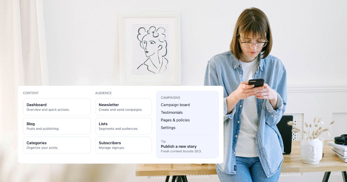
The solution came in the form of a mega menu built into the sidebar. Rather than scattering navigation across multiple areas, everything is now consolidated in one place — organised into clear sections like Content, Audience, Campaigns, Store, Growth, and Operations.
Each section surfaces the most relevant pages at a glance, with a contextual tip at the bottom to nudge users towards useful next actions (like publishing a new story, or reviewing top-selling products). It's structured, but not overwhelming.
Why This Works Better
The mega menu approach solves a few things at once:
- Simplicity. Users no longer have to hunt across two navigation areas. One click opens a well-organised panel that shows everything relevant to where they are in the platform.
- Context. The menu adapts based on the area you're working in — whether that's content and marketing, or store management and fulfilment. The right options appear at the right time.
- Clarity for non-technical users. Labels like "Orders — Timeline, filters, and fulfilment" or "Subscribers — Manage signups" tell you exactly what you're getting before you click. No jargon, no guesswork.
It's the Details That Matter
Getting navigation right is one of those things that's easy to overlook — until it's wrong. A clunky menu slows people down, creates frustration, and makes a product feel unfinished. A well-designed one becomes invisible; users just find what they need and get on with their day.
After a lot of iteration, I'm genuinely happy with where this has landed. It's cleaner, simpler, and — most importantly — it feels right.
More updates to come as Cosmos continues to grow.